more on my new old house
 Thursday, June 3, 2010 at 10:04AM
 I already have strong ideas of what I want to do in my kitchen, my upstairs bathroom, my bedroom, and the library.
But I need some input on the other three rooms on the main level of my new old house.
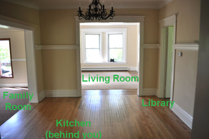
The main level is laid out in a unique way, with the dining room at the center. You have to walk through the dining room to get anywhere else, so it's important that the dining room color look good with everything I choose.
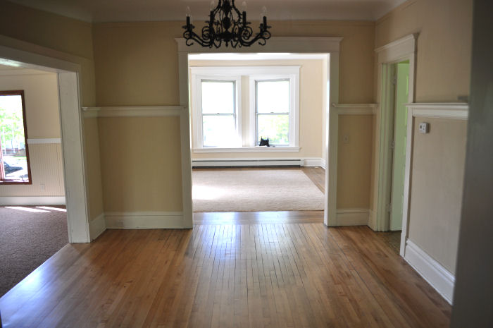
Here are some labels, for reference.
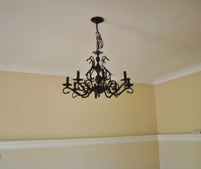
The dining room has a lovely chandelier, and I serendipitously found a bag of faceted prisms in a kitchen drawer that I'd like to use at some point.
In the dining room will go a round oak dining table with high-backed mission style chairs (the finish is like a cross between a walnut and a mahogany -- medium brown with a touch of red and gold). I also have a beautiful antique hutch that I bought at an estate sale for a ridiculously cheap price. (Awesome discovery: antiques in this area are about 1/6 of the price of vintage stuff on the East Coast.)
You can also see that the dining room has plenty of light from the surrounding rooms, but no windows of its own.
I want to paint the dining room a shade of brown that is not beige, not taupe, not mushroom, not mocha. Something a little richer than that, something warm. My thinking is that a brown will look cozy at family dinners, and will also not clash with my plans for any of the other rooms.
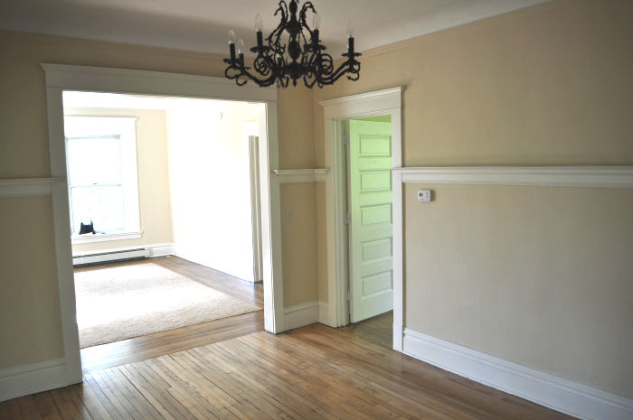
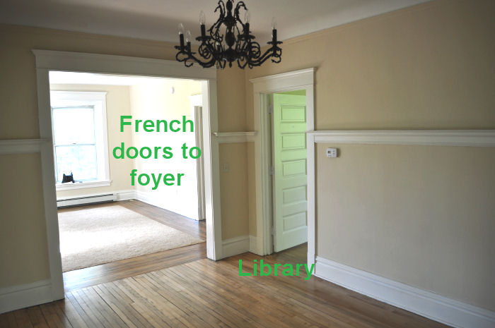
I need suggestions for the shade of brown. Brand of paint doesn't matter -- Benjamin Moore, Behr, Sherwin Williams, etc. I can get the color matched. Remember: warm, cozy, inviting, not beige. Something in the medium-dark range.
I know the library will be a viridian green.
I know that I just found a green and white floral club chair that I want to put in the living room. Leafy green on a white background.
I know that my couch is a camely-tan.
I know that it's cold here much of the year, and that I don't want any colors that are too icy or too tropical. With nine foot ceilings, huge windows, and hardwoods, I'm concerned that colors that are too pale will look washed out by the bright sun, and that colors with too much grey will be depressing in the winter. (The less depressing your house is, the better, I'm thinking? Yes?)
I know that I'm more comfortable with color in my home than the average person is. My studio would be blindingly bright for some of you.
I know that my favorite colors are blue-greens, green-blues, blue, green, brown, and pink.
What colors should I paint the living room and family room? I'm trying to think of the main level of my house as a colorway, with a medium/dark brown, viridian green, jade-ite green, and now I need two other colors that don't look too juvenile or ridiculous.
(I love purple with brown and green, but don't think I can do bright violet on the walls of my living room.)

The family room was an addition to the house -- perhaps in the 1980s. It needs some TYT = The Yarnista's Touch. I have no idea what that is, I just made it up. But the room definitely needs it.
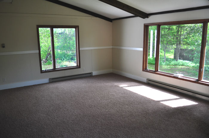
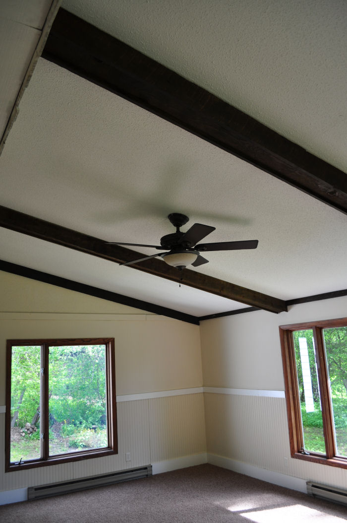
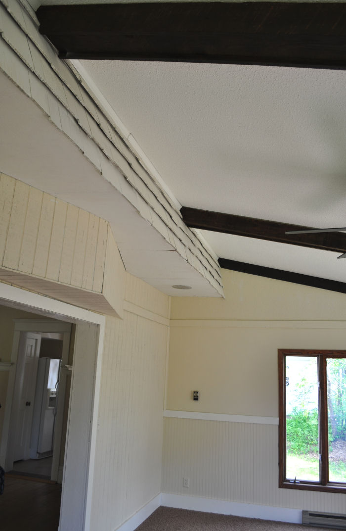
Indoor cedar shingles. Interesting.
Should I paint the beadboard in here white? If so, what color should I put above it? Should I paint the ceiling beams magenta?
Just kidding.
If you read this far, here comes the good part:
I will give away a $25 gift certificate to anyone who can help me pick a brown color for my dining room, and who can offer a winning suggestion for the living room and another for the family room. (Three prizes total.)
You can enter as many times as you like.
Leave the links in the comments section.
Think about the main level in terms of a colorway -- everything has to look good together, but not necessarily match.
Nothing even remotely close to beige.
Warm and inviting.
You have until Friday, June 4th, at noon central time to send in your suggestions. If I use yours, I'll send you a gift code.
Go forth and swatch surf!

Reader Comments (62)
Suggestions for brown/red: Glidden Cinnamon Stick, Crisp Autumn Leaves, Spiced Gingerbread
Suggestions for viridian type color: Glidden Totally Teal (a lighter color: Deepest Aqua)
If you really want to go to the purple: Glidden Black Tulip, Delicious Plum
(My monitor doesn't render colors so fabulously so this is all conditional)
Concern: the house has wonderful natural light Right Now but your latitude has lots of hours of darkness as you well know. Having all the rooms dark intense shades will eat up what light you have in those long winter months so consider the idea of having at least one of these adjoining rooms a lighter tone light-reflecting shade, despite your not being a taupe person!
I'm so excited for you! And I totally just spent like 2 hours looking at paint combos :P
I used all Valspar Historical Color paints, which would fit really well. I used the Jade green as a base, but a little deeper color, since that's what your swatch showed.
All the swatches can be found here: http://www.valspar.com/explore-colors/historic-colors/paint-colors.html
I totally have more than one too, so hang on :P
Dining Room: Del Cornado Brickstone 1006-9B. Red undertones to compliment your wood furniture and those pretty floors.
Library: Fairmont Penthouse Mosaic Green 5008-8C. It's a deeper Jade shade, but I think that's what you have in mind.
Living Room: Lyndhurst Roseglow 1006-10A. Not only is this in the Lyndhurst mansion, but it has hints of lilac and is "adult appropriate"
Family Room: You should definately paint the beadboard white! In Woodlawn Whitewash 6008-1A and the top Belle Grove Valley Fog 5003-1B. I know you said "no gray" but I think this has enough of a blue undertone that the room will look really serene and calm. That gives way to add lots of fun pops of color with your accessories.
Ok next one ;)
Paints are still Valspar, found here: http://www.valspar.com/explore-colors/historic-colors/paint-colors.html
Dining Room: Cooper Adobe Brown 3011-9. This is probably really dark, but is rendering on my crappy computer a bit muted. I think it would look nice with crisp white trim.
Library: La Fonda Tortuga 5007-6A. This isn't as deep as the other, but more of a natural jade.
Living Room: Coral Gables Biltmore Mediterranean Caramel. 2007-8A. On my monitor this has an orange undertown. You could even go a bit more orangey to contrast with your couch or slipcover that sucker!
Family Room: A different white, more of a gray tone. Woodlawn Snow 6003-1A. I think this would work well on both the beadboard and the ceiling. It would bounce the light of the day perfectly into the slightly darker living room. On top, Cinccinatian Hotel Linder Blue 4005-3C. This looks almost "cornflower" to me, but less royal blue and hint of purple. Bright and fun!
I have always had a place in my heart for sage green, chocolate brown, and powder blue. I really really want to paint one wall in my room with all three. Blue on top, with a division and Chocolate brown and green stripes at the bottom. Unfortunately, im not allowed to paint my walls. BOO! :(
So perhaps powder blue for your living room or family room.
One more ;P still Valspar found here: http://www.valspar.com/explore-colors/historic-colors/paint-colors.html
Now this is just me. Please feel free to tell me shove it :) I noticed in the pictures you posted that the dining room was getting some shadows. And like Gwen said above, painting all of these rooms rich colors, ecspecially the dining room, could make it look really, really dark in the winter months and evening hours. With the addition of your beautiful wood furniture and floors, you run this risk of the room looking "woodsy". So this is a totally different color suggestion, but still rich and warm.
Dining Room: Jekyll Club Veranda Blue 4004-6B OR a shade lighter 4008-4A Jekyll Club Pulitzer Blue. Here's why I like these colors. They're rich and warm; yes they have a grey undertone, but just enough to make the room feel bright, not "navy". Crisp White trim with your furniture will make the room look absolutely regal.
Library: I went for funky. This is alot deeper than a Jade, but it's the library. Have a little fun! Monterey Bay Teal 5004-10C
Living Room: Grand Hotel Awning Yellow 2008-1C. This color is so cheery to me and I think would look tres cute with your chair. I'm imaging a sort of "garden room" with lots of greens and some simple plaids.
Family Room: Woodrow Wilson Maize 3005-8C on the beadboard and Woodlawn Music Room 3007-3C on the top. I love that it's almost monochromatic even though the bottom is actually a (gasp) beige. It's all about the undertones.
You really love jewel tones, me thinks, Sharon and I love that you're not afraid to have fun with color (obviously or we'd get some really boring yarn). All of these are pretty much interchangeable (an obviouly to a default cause of color rendering).
I have to say too, even if I don't win, this was *the* most fun I've ever had entering a contest. I really hope that we're able to help you decide and I feel really special being a part of your new house journey :)
How about Farrow and Ball's 'Tanner's Brown"? May be a bit dark for a room with no windows, but that could just emphasise its place at the centre of the house. The Farrow adn Ball colours are worth looking at just for the names - Elephant's Breath anyone?!
http://www.farrow-ball.com/productdetails.aspx?pid=0255TB&cid=PC&language=en-GB
Alternatively, Picture Gallery Red could be brown enough without being too dark?
http://www.farrow-ball.com/productdetails.aspx?pid=0042PG&cid=PC&language=en-GB
For the dining room:
C: 0, M: 53, Y: 100, K: 37 (hex #a14c00), a chestnutty brown.
C: 30, M: 60, Y: 100, K: 40 (hex #6b3d00), a dark mahogany brown.
C: 0, M: 52, Y: 100, K: 35 (#a65000), slightly reddish brown
And my personal favorite: C: 10, M: 50, Y: 100, K: 35 (#955300) I think this would match with your hardwood floors very well. A very warm, happy, inviting color... for me.
And then for the living room and the family room, a green and a magenta-ish color. For the green, I love this muted color:
C: 43, M: 0, Y: 34, K: 38 (#5a9e68) or this darker blue-green: C: 80, M: 15, Y: 0, K: 45 (#1c778c). Haven's found the right shade of magenta yet...
Sorry for not giving a paint-specific color >.<
Okay, after a whole lot of fooling around with paint picker sites, I found a few different
shades of brown that I feel would work the best for your dining room. As I'm sure has already been said (as if the Queen of Color would even need reminding anyway), it's best to test them out on your walls before comitting yourself.
Peanut Butter (#2159-20)
http://www.myperfectcolor.com/Benjamin-Moore-2159-20-Peanut-Butter-p/mpc0005132.htm
Colors that seemed to complement (on my monitor, you know the usual caveat):
Butter (#2023-60)
http://www.myperfectcolor.com/Benjamin-Moore-2023-60-Butter-p/mpc0004184.htm
Green Meadow (#2040-20)
http://www.myperfectcolor.com/Benjamin-Moore-2040-20-Green-Meadows-p/mpc0004299.htm
Summer Basket Green (#2040-40)
http://www.myperfectcolor.com/Benjamin-Moore-2040-40-Summer-Basket-Gre-p/mpc0004301.htm
Golden Bark (#2153-10)
http://www.myperfectcolor.com/Benjamin-Moore-2153-10-Golden-Bark-p/mpc0005089.htm
Cork (#2153-40)
http://www.myperfectcolor.com/Benjamin-Moore-2153-40-Cork-p/mpc0005092.htm
Another good possibility:
Butterscotch from Sherwyn Williams (similar to the PB) combined with #170 from Benjamin Moore
If I can find time again later this morning, I'll study the other rooms and see what, if anything, I can come up with. For now, I'm out of time!
I have two suggestions:
Behr 770B-7 Chocolate Sparkle
or
Behr 250F-6 Pepper Spice
I love brown paint. I recently painted my kitchen a light coffee with cream brown.
I love your new house! Its really awesome except for all the beige walls. What where they thinking?
Anyway I totally suck at decorating so I have no idea of an exact shade of brown. I would probably go for something in a medium oak shade. My house though is painted in avocado green and browns, well except for my girls room which I think of as pepto pink. Anyhoo probably not much help there either.
Hey you could paint one wall in your favorite bright purple and then tone it down some on the other walls. Just a thought!
What about a reddish brown for the dining room. Benjamin Moore Audubon Russet is a deep reddish almost clay red-brown. http://www.benjaminmoore.com/bmpsweb/portals/bmps.portal?_nfpb=true&_windowLabel=contentrenderer_1_2&contentrenderer_1_2_actionOverride=%2Fbm%2Fcms%2FContentRenderer%2FrenderContent&contentrenderer_1_2NodeUUID=%2FBEA+Repository%2F306001&_pageLabel=fh_explorecolor
Or the Roxbury Caramel is a bit warmer with a bit more yellow, also gorgeous.
http://www.benjaminmoore.com/bmpsweb/portals/bmps.portal?_nfpb=true&_windowLabel=contentrenderer_1_2&contentrenderer_1_2_actionOverride=%2Fbm%2Fcms%2FContentRenderer%2FrenderContent&contentrenderer_1_2NodeUUID=%2FBEA+Repository%2F306001&_pageLabel=fh_explorecolor
http://www.materials-world.com/paint-colors/martin_senour/martin-senour-07.htm
love, LoVe, LOVE Martin Senour's Grandma's Fudge. Warm, cozy brown for your dining room. I have this in my bedroom and loved it so much I painted my living room/entry with it too.
I think these two colors would blend perfectly with the rest of the house. It will also keep warm thoughts in your head throughout the long cold winter months. They have tropical names but are very muted.
For the dining room, Coconut Grove
http://www.benjaminmoore.com/bmpsweb/portals/bmps.portal?_nfpb=true&_br=1&_pageLabel=fh_home&np=colors/1029
For the living room, Pineapple Grove and keep the bead board white. The beams on the ceiling would look good painted in the coconut grove shade (or whatever shade you choose for the dining room) and it would tie in the colors.
http://www.benjaminmoore.com/bmpsweb/portals/bmps.portal?_nfpb=true&_br=1&_pageLabel=fh_home&np=colors/333
And if you really don't want to do white, perhaps a simple off-shade like:
http://www.benjaminmoore.com/bmpsweb/portals/bmps.portal?_nfpb=true&_br=1&_pageLabel=fh_home&np=colors/925
Good luck, I know it took 10 years before I found the perfect color for the outside and inside of the house.
I love your house, and I'm sure with your natural color sense it will be fabulous!
I had such fun playing on Benjamin Moore's "Personal Color Viewer"! You choose your room, then you can flip through the color chips and change the wall color as well as the trim. It is a wonderful planning tool.
I really liked Honeycomb, Plymouth Brown, Hidden Valley and Seed Brown - but as a pp noted, the low light levels you get in winter should be considered. I think the brown in the yarn you showed would be lovely! (Or the brown in Gingerbread House.)
As for the living room, with that much space and light, you should really go for the fun colors. My kitchen is similar, spacious and light filled (one east window and a south-facing patio door) and it is a wonderful key lime green, with grape purple curtains and accents. (I have white counters to offset the color.) You could paint that beadboard white, then go with a bright, cheerful fun color above it - I love B. Moore's Amethyst Cream. (Either that, or a lighter shade of Oberon!) It would go with the brown and viridian, and it would make you smile every time you saw it.
Thanks for sharing your amazingly beautiful house with us, as well as the journey you are making as a Full Time Yarnista. It couldn't happen to a nicer person!
I think you should do a nice, warm light brown like a latte with a bit of creamer (surprise? Why would I choose brown huh?) for the dining room. Sherwin Williams color Hot Cocoa (#6047) or if you want something a little brighter, maybe Jute Brown #6096.
For the living room, I would do the wall you see from the dining room in a contrasting color (a deep red brown such as SW Fired Brick #6335) with the other 3 walls something lighter such as SW Sunrise #6668.
For the family room, hmm, you could use a blue/purple such as SW Dewberry #6552 for the beadboards and maybe water down the paint so the beadboard shows through a bit. Then paint the wall itself white. It will look vibrant. Hehe.
Of course, I stink at color choices and go for deep brown and greens and purples most of the time.
Loving it tho!
When I look for colour inspiration, I look in two places: YARN and FABRIC. I am going to suggest Anna Maria Horner's Drawing Room Fabric Collection, with the print Volumes in Blue.
Here is an online swatch. There is a green that is quite close to one of your viridian greens (little white/colour 1 plus a little colour 2)
http://www.hawthornethreads.com/fabric/designer/anna_maria_horner/drawing_room/volumes_in_blue
I love the warm brown that Anna Maria uses (I'd buy a yard of fabric and take it in to the paint store to get it matched!), and then for the family room I would choose the golden straw stripe (pictured at the very very top of the fabric swatch), and the living room I would choose the aqua blue that is the background of the fabric! Accent pieces, lamps, etc should ABSOLUTELY pull in the orangier colour. Yes, yes, yes!
FUN FUN FUN! Now I want to repaint my house!
Jen
I looked through Sherwin Williams and liked Turkish Coffee (6076) for the Dining Room and Thermal Spring (6761) for the living room. https://www.sherwin-williams.com/visualizer/
We have strong color in our rooms too downstairs which due to an open flow move through angled walls and arches from one wall to another, so we started with a deep dark red in the living room, to a cinamon brown in the dining room, to a rust copper color in the foyer. In the winter of MN it glows and in the summer feels cool and refreshing.
I love the bones of your house and can't wait to see how you transform it.
Shoot, I attached a link to the right fabric but I prefer the tones that are showing in this version, plus it gives you a better idea of the shade of brown.
Try this one:
http://www.ciaspalette.com/prod_pages/fshd0650.html
(isn't it funny how the photograph/lighting can so much affect the colour that shines through???!!!)
hmmmm toughy.
i like carob: http://www.benjaminmoore.com:80/bmpsweb/portals/bmps.portal?_nfpb=true&_pageLabel=fh_explorecolor&np=colors/AF-160 but this may be a little to mocha for your tastes
oh and did you see these purples for your living room? http://www.sherwin-williams.com/do_it_yourself/paint_colors/color_trends/conscious_luxury/index.jsp