
more on my new old house
I already have strong ideas of what I want to do in my kitchen, my upstairs bathroom, my bedroom, and the library.
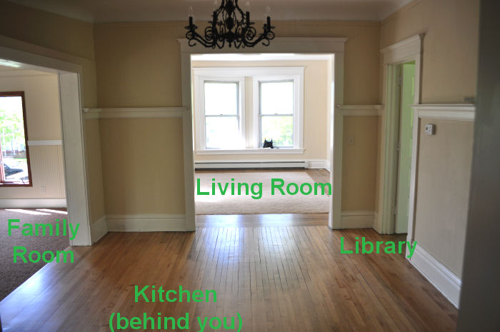
But I need some input on the other three rooms on the main level of my new old house.
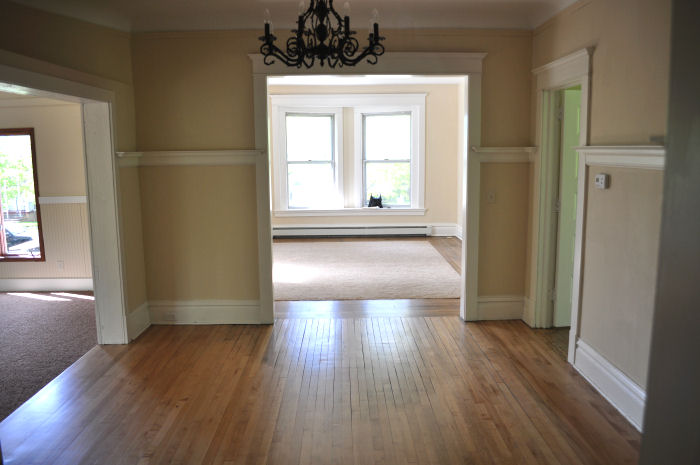
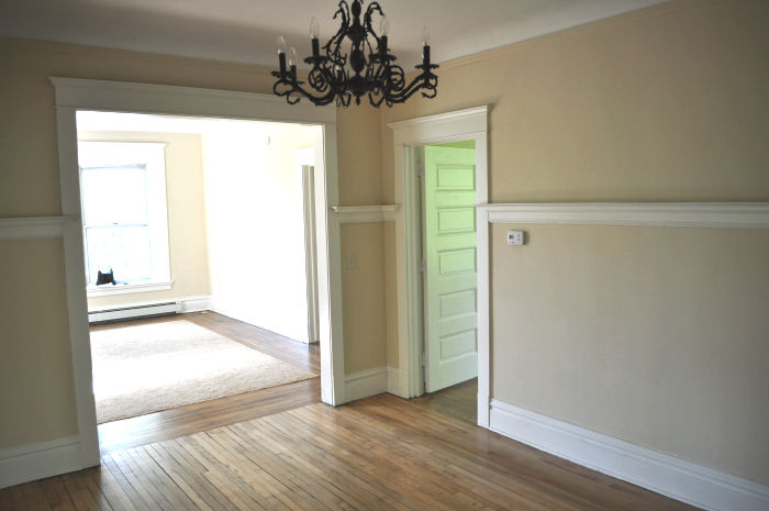
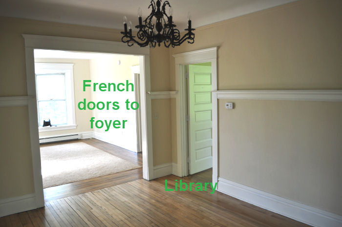
The main level is laid out in a unique way, with the dining room at the center. You have to walk through the dining room to get anywhere else, so it's important that the dining room color look good with everything I choose.
Here are some labels, for reference.
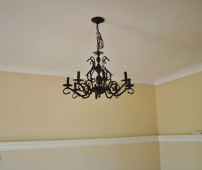
The dining room has a lovely chandelier, and I serendipitously found a bag of faceted prisms in a kitchen drawer that I'd like to use at some point.
In the dining room will go a round oak dining table with high-backed mission style chairs (the finish is like a cross between a walnut and a mahogany -- medium brown with a touch of red and gold). I also have a beautiful antique hutch that I bought at an estate sale for a ridiculously cheap price. (Awesome discovery: antiques in this area are about 1/6 of the price of vintage stuff on the East Coast.)
You can also see that the dining room has plenty of light from the surrounding rooms, but no windows of its own.
I want to paint the dining room a shade of brown that is not beige, not taupe, not mushroom, not mocha. Something a little richer than that, something warm. My thinking is that a brown will look cozy at family dinners, and will also not clash with my plans for any of the other rooms.
I need suggestions for the shade of brown. Brand of paint doesn't matter -- Benjamin Moore, Behr, Sherwin Williams, etc. I can get the color matched. Remember: warm, cozy, inviting, not beige. Something in the medium-dark range.
I know the library will be a viridian green.
I know that I just found a green and white floral club chair that I want to put in the living room. Leafy green on a white background.
I know that my couch is a camely-tan.
I know that it's cold here much of the year, and that I don't want any colors that are too icy or too tropical. With nine foot ceilings, huge windows, and hardwoods, I'm concerned that colors that are too pale will look washed out by the bright sun, and that colors with too much grey will be depressing in the winter. (The less depressing your house is, the better, I'm thinking? Yes?)
I know that I'm more comfortable with color in my home than the average person is. My studio would be blindingly bright for some of you.
I know that my favorite colors are blue-greens, green-blues, blue, green, brown, and pink.
What colors should I paint the living room and family room? I'm trying to think of the main level of my house as a colorway, with a medium/dark brown, viridian green, jade-ite green, and now I need two other colors that don't look too juvenile or ridiculous.
(I love purple with brown and green, but don't think I can do bright violet on the walls of my living room.)

The family room was an addition to the house -- perhaps in the 1980s. It needs some TYT = The Yarnista's Touch. I have no idea what that is, I just made it up. But the room definitely needs it.
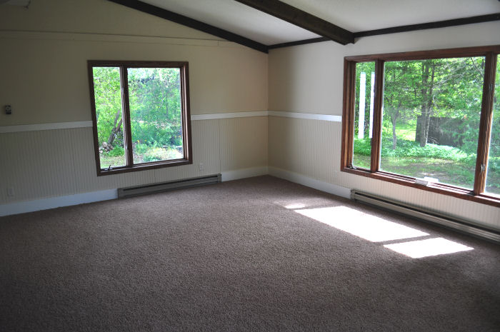
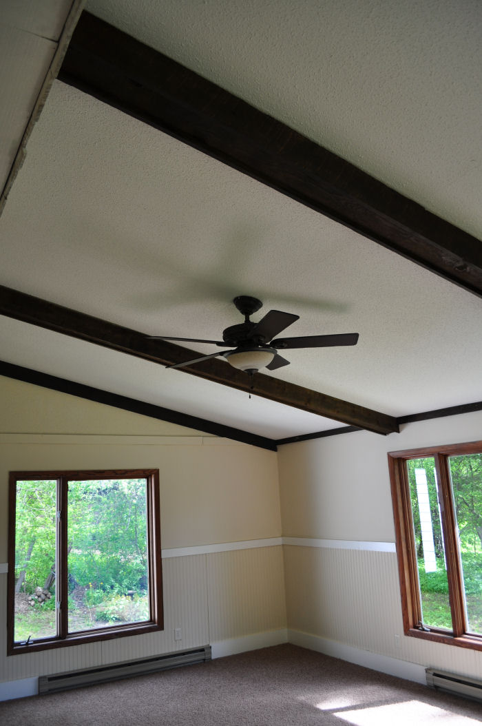
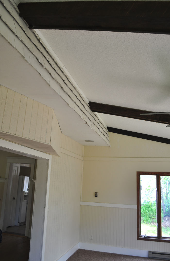
Indoor cedar shingles. Interesting.
Should I paint the beadboard in here white? If so, what color should I put above it? Should I paint the ceiling beams magenta?
Just kidding.
If you read this far, here comes the good part:
I will give away a $25 gift certificate to anyone who can help me pick a brown color for my dining room, and who can offer a winning suggestion for the living room and another for the family room. (Three prizes total.)
You can enter as many times as you like.
Leave the links in the comments section.
Think about the main level in terms of a colorway -- everything has to look good together, but not necessarily match.
Nothing even remotely close to beige.
Warm and inviting.
You have until Friday, June 4th, at noon central time to send in your suggestions. If I use yours, I'll send you a gift code.
Go forth and swatch surf!
 Yarnista
Reader Comments (62)
How about a coffee colour for the dining room? Preferably in the shade that matches how you take your coffee. That would be fun. On my monitor, toasted marshmellow looks close. http://www.benjaminmoore.com/bmpsweb/portals/bmps.portal?_nfpb=true&_windowLabel=contentrenderer_1_2&contentrenderer_1_2_actionOverride=%2Fbm%2Fcms%2FContentRenderer%2FrenderContent&contentrenderer_1_2NodeUUID=%2FBEA+Repository%2F306001&_pageLabel=fh_explorecolor
Possibly Fort Summer tan.
There are a LOT of unsatisfying browns on this site. There's also Ten Gallon Hat. Which I don't love as much, but the name adds a lot to it.
I can't get individual links to work, for some reason. But you can enter the names and see them.
Oh, or Morning Coffee. It might be a bit dark, especially in winter, but maybe if you added some cream to it?
http://www.benjaminmoore.com/bmpsweb/portals/bmps.portal?_nfpb=true&_windowLabel=contentrenderer_1_2&contentrenderer_1_2_actionOverride=%2Fbm%2Fcms%2FContentRenderer%2FrenderContent&contentrenderer_1_2NodeUUID=%2FBEA+Repository%2F306001&_pageLabel=fh_explorecolor
There's nothing more challenging than picking just the right paint color, and I definitely recommend trying out several samples and viewing them at different times of the day to see how the light - and the color - changes throughout the day. I would suggest the Benjamin Moore Desert Camel 2162-20 for the brown in your dining room. And then you could use Aztec Yellow 2152-20 in either the living room or family room. Good luck!
I think your dining room should be painted Brown Fabulosity. At least, that's the name you gave the yarn you just sent me: http://www.flickr.com/photos/25292326@N08/4637772434/in/set-72157604354112314/. I'll even send you back some for color matching, since I only need enough for trim. :-)
I see chocolate with chili...coffee with just stirred in cream...a warm blush of a just baked loaf of crusty bread....wait... what were we talking about?
Behr has 3 brown colors that I like. Cinnamon spice, Pepper Spice, and Harvest Brown. I think I like Harvest Brown the best. I would use it if I wasn't repainting my house to 'neutral' colors. ( They are not my first choice. I like color)
i've had great success with Ben Moore Historical Colors (both interior & exterior) . A warm color that is surprisingly neutral would be HC-7 bryant gold or HC-9 chestertown buff
http://www.benjaminmoore.com/bmpsweb/portals/bmps.portal?_nfpb=true&_br=1&_pageLabel=fa_home&np=colors/HC-7
http://www.benjaminmoore.com/bmpsweb/portals/bmps.portal?_nfpb=true&_br=1&_pageLabel=fa_home&np=colors/HC-9
Sherwin-Williams has a palette that would look great in your old house: http://www.sherwin-williams.com/do_it_yourself/paint_colors/todays_colors/treasured/index.jsp
The "smoky blue" would look great in the family room, although I would actually paint the beadboard blue and paint the walls a warm,cream color (like "interactive cream"). That way there won't be a huge transition from your beadboard to your wall to your ceiling.
A warm coffee brown or perhaps the colour of dark bittersweet chocolate?
Re my previous post, that was for the dining room. I have to think more for the other rooms. :-)
For the dining room, Sherwin Williams Virtual Taupe SW 7039 (NOT beige!) is a nice neutral that you can accent with lots of color (reds, orange, warm green) http://www.sherwin-williams.com/search/?Ntt=SW+7039&chkFilter=home&chkFilter=color&fromsearch=1.
Bauguette (SW 6123) is another warm color which works with lots of accents for the living room.
For the family room, I think white beadboard, the walls a warm gray, (SW 2845 Bunglehouse gray) and either a funky fabric or wallpaper on the ceiling between the white painted ceiling beams. The Wallpaper Company 20.5 In. W Pearl Modern Geometric Design Wallpaper Model # WC1281850 Internet # 100630500
The Wallpaper Company 20.5 In. W Mauve Multicolored Modern Large Scale Leaf Stripe Wallpaper
Model # WC1283879 Internet # 100632391
Or you could do some cool graphics http://www.whatisblik.com/shop/explore?color_groups=112&p=1&limit=1000
For the dining room, I think a saddle brown, if you want to go darker, or a darker sand with a bit of pink, if you want to go lighter. Lowe's Home Improvement has some great color palettes in the Earth Elements line. I think you might be able to paint all three rooms from that, especially in palettes #1 and #4. Specifically, Timber for the dining room, Botanical for the family room, and either Valley or Dark Marsh for the living room, from palette #1. Good luck!
Not about color, but that addition. Yikes, it looks like part of a Wausau home. I'm working on a project involving two of them right now. They are "Component Construction" , built in a factory (in Wausau WI) as roof trusses, wall panels and floor panels then transported and built into place.
I love the chocolate sundae color from Benjamin Moore.
Follow this link and click on the mirror to show the bedroom the room in the mirror features chocolate sundae. Click on the "bedroom" link and the Sublime Design room featuring the chocolate sundae will show. I think it's lovely.
(in case the html didn't work...
http://www.benjaminmoore.com/bmpsweb/portals/bmps.portal?_nfpb=true&_windowLabel=contentrenderer_1_2&contentrenderer_1_2_actionOverride=%2Fbm%2Fcms%2FContentRenderer%2FrenderContent&contentrenderer_1_2cnp=public_site%2Farticles%2Fmain_page_articles%2Ffh_explorecolor&contentrenderer_1_2np=public_site%2Farticles%2Fapplication_article%2Fapp_personal_color_viewer&_pageLabel=fh_explorecolor)
Here's a link to the color swatch:
http://ep.yimg.com/ca/I/yhst-13463548100242_2103_59086165
Lol...before I got read very far I was thinking, Oh! I would paint the dining room brown! And, lo and behold--brilliant choice! I think that Behr's Ground Nutmeg (S-H-230) is a nice, warm brown that would be lovely to stand next to and see more lively colors from the other rooms.
Are you sure about no purple? It loves brown, you know, and brown loves it right back. What about a purple that leans more towards blue...like Wild Wisteria (630D-5)?
And for the third room, Artesian Water (S-G-550).
A cheery amd welcoming, but soothing combination, I think. Oh, and I would do the beadboard white with the color above and would totally play up the Shingles That Used To Be Outside But Are Now Inside with another splash of fun color. It would be like a little treat that you wouldn't see until you were actually inside the room. That's part of the quirky fun of old houses!
I can't seem to get a direct link to each individual color, but if you go to this page and scroll down to the log in (bottom, left-ish), I've saved all of the colors together as a project called "new old house."
http://www.behr.com/Behr/home#vgnextoid=6bd8ea6621ca5110VgnVCM1000008119fea9RCRD;channel=EXPLORE;view=14
The log in info is gretchenknits (at) gmail (dot) com and the password is 3irishgirls. The fourth color on the palette is the closest match I could find (with my monitor) to your lovely viridian green. My apologies if my monitor is showing me a color that is completely off.
I can't wait to see what you decide! So many good suggestions and you might go off in another gorgeous direction of your own!
Try Sherwin Williams 6034 Arresting Auburn for the dining area. It's a warm mid-range brown.
So I happened upon your predicament of not wanting a bright violet on the walls of your living room. I get that. I didn't want a bright orange on my walls (esp. here in Bronco-land) but I wanted something to "rev" me up and inspire me. So what I did was put tonal colors on 1 wall and a very neutral "parchment" color on the other three walls. A little more contemporary of a look if you ask me, but...
So if I were you and wanting violet, but not wanting to be known as the "funky lady who put violet on her walls" I would do just this:
Paint a softer tone of violet, something with more tint to it, to one wall. Preferably the wall that gets more light. And then sponge over that paint with stronger violet hued glaze. (Every Home Depot on the planet would help you find the right glaze and help you mix it.) Or the other option is to paint the initial color on the wall and in a very "artistic" way, apply venetian plaster (that has been colored to the darker hue) in random areas on the wall. I've seen this done very nicely in a dining room in the same violet tones you are loving right now.
Just some ideas... I love to paint walls!
Melt a bar of dark chocolate with a generous handful of butterscotch or peanut butter chips, then swirl until blended. That would be a lovely inviting color! I'm thinking of a cian-like yellow for my own living room, with perhaps a key lime green accent wall in my kitchen. My bedroom reminds me of you, with its sky blue walls and dark chocolate trim. It came like that, though on contemplating a Morgaine-like wall instead.
Behr's "New chestnut" 280F-5 for the dining room.
Or "Sweet Georgia Brown" 280F-6.
gotta think on the other ones.